Mall-style shopping, elevated and at home!
Myntra is one of the largest e-commerce retailers in India. They are largely a fashion apparel platform, but also carry products relating to beauty, home and electronics.
Myntra is one of the largest e-commerce retailers in India. They are largely a fashion apparel platform, but also carry products relating to beauty, home and electronics.
The Brief
Online shopping was a different ballgame when Myntra first approached us. Today e-commerce sites offer us a myriad of storefronts that mimic in-person shopping experiences. However, at the time we worked with Myntra, the e-commerce world was considerably new and storefronts were not a popular concept. They wanted to transform the way online shopping was being experienced and make the whole journey more fun and realistic.
We had just finished designing and building Myntra’s very first android application, after which we turned our attention to their desktop site. Unfortunately, halfway through the design process, the new parent company (Flipkart, another of our clients) opted to try an app-only route. Though these designs never saw the light of day, we believe that the work remains strong.
Strategy
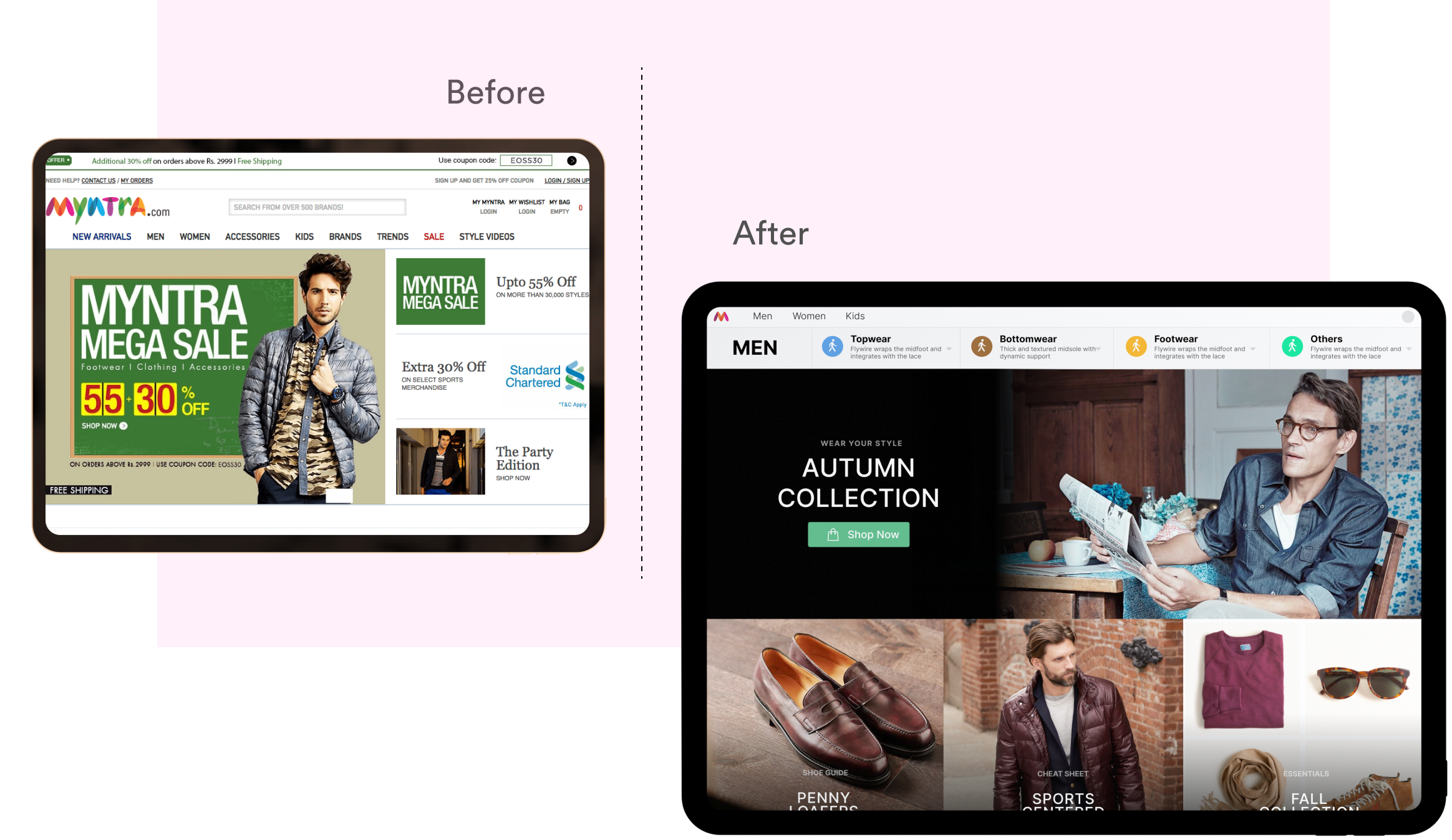
As Myntra has a great collection of products, we wanted to ensure the UI and UX showcased the extensive product range without confusing the customer. We wanted everything to be organised and laid out as conveniently as possible.
Though the desktop site existed, it was not as user friendly and well-categorised as it could be. The concepts were there but the user interface and experience lacked clarity and convenience. There was no cohesive direction and the design, content and marketing came across a bit disconnected from each other.
We were keen to inculcate a solid style, while not disposing of the brand’s ideas. The aim was to have unity while creating a comfortable desktop experience.
Design
Our first concern was co-creating the best possible fashion experience for online shoppers. In 2013, the Indian fashion market was young and we quickly realised that we needed to help build the market in addition to the platform we were building. We had to reach and provide customers with the tools and space for shoppers to be able to find what they were looking for.
One of the key decisions Myntra had made was to invest heavily in content. The company built a small content army to educate shoppers on topics ranging from fashion trends to how to wear a tie and everything in between.
Our redesign supported this content-first approach, so as to give equal prominence to the collections, products and information. Strong yet flexible grids, carefully-chosen colour palettes, distinctive typography as well as a clear information hierarchy helped build what remains an extremely attractive online storefront.
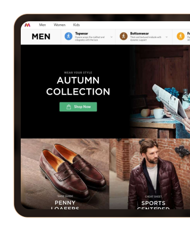
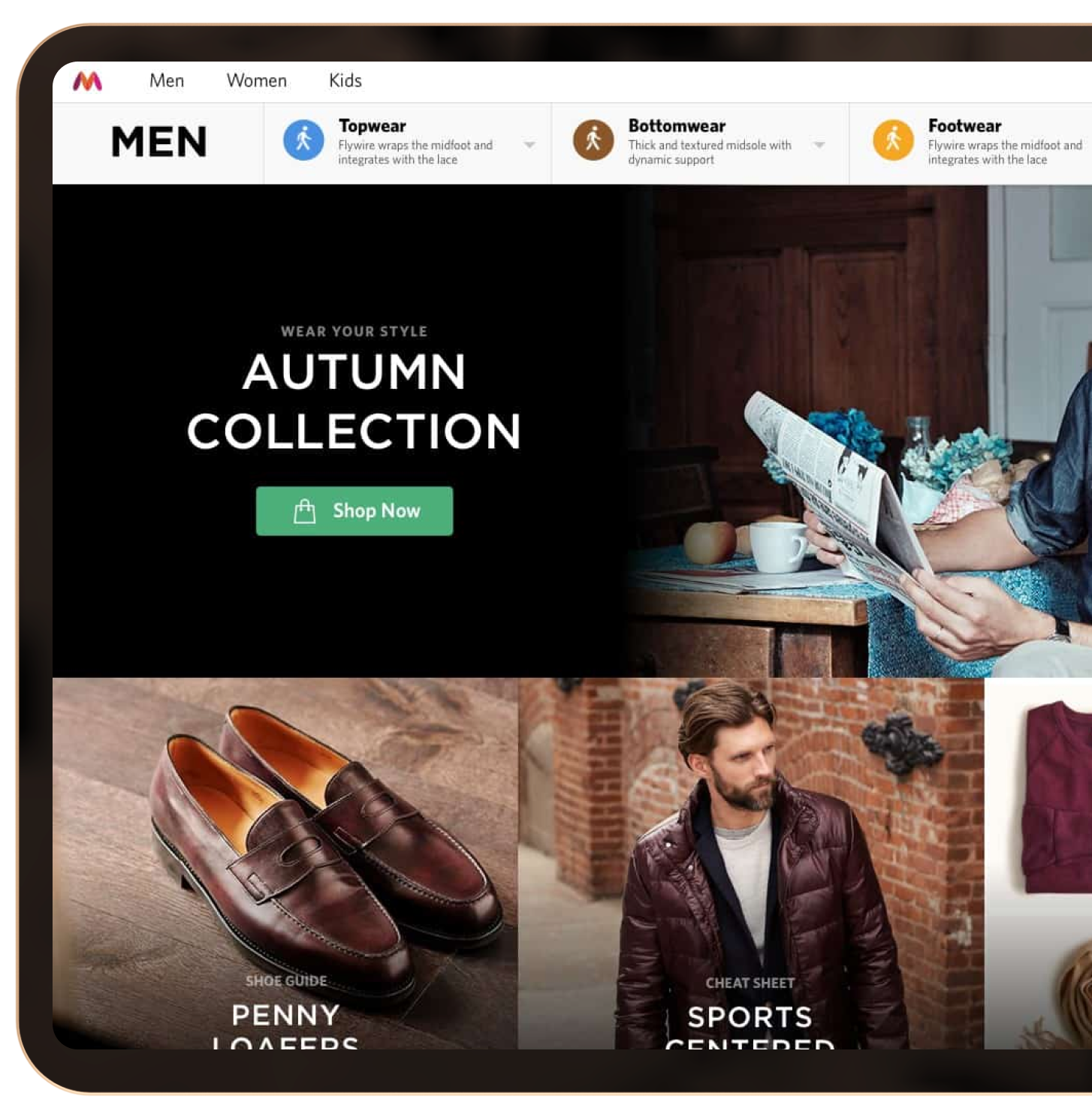
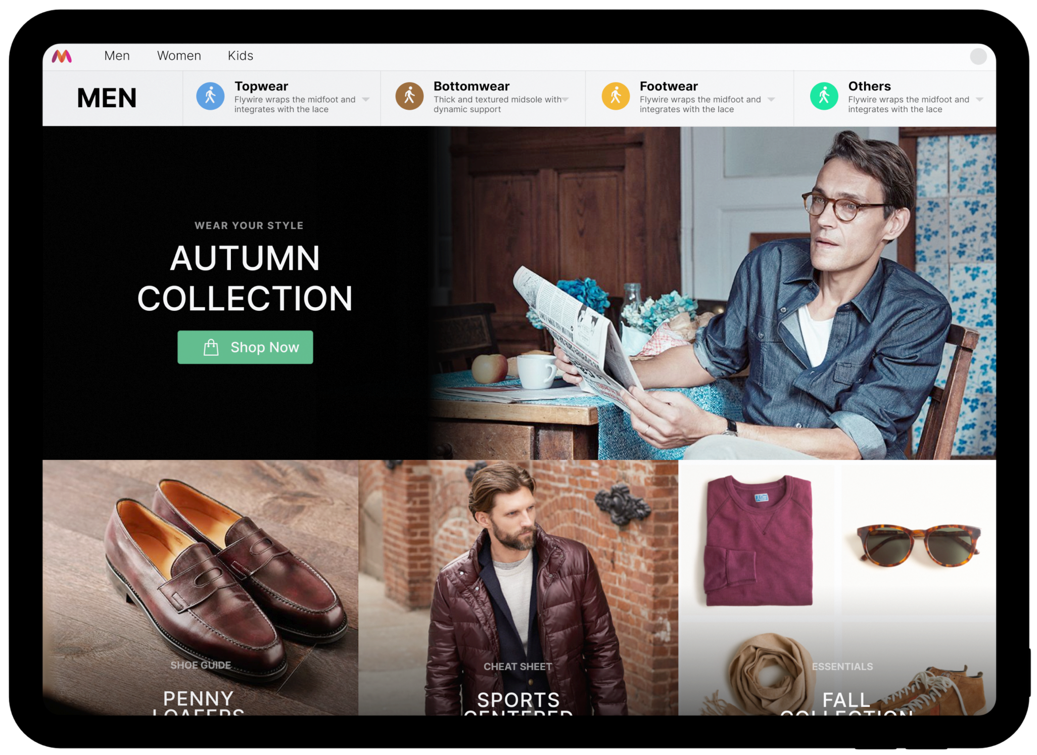
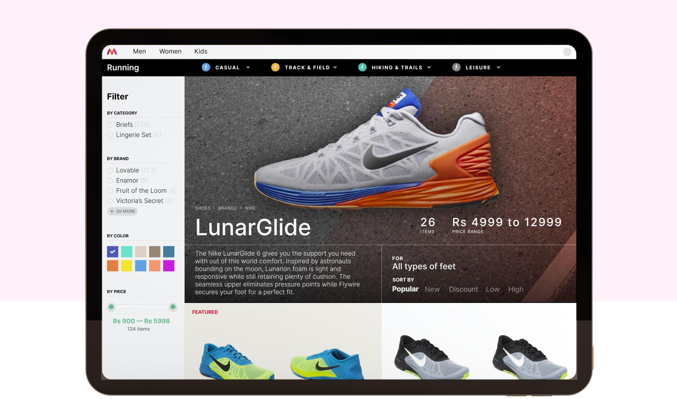
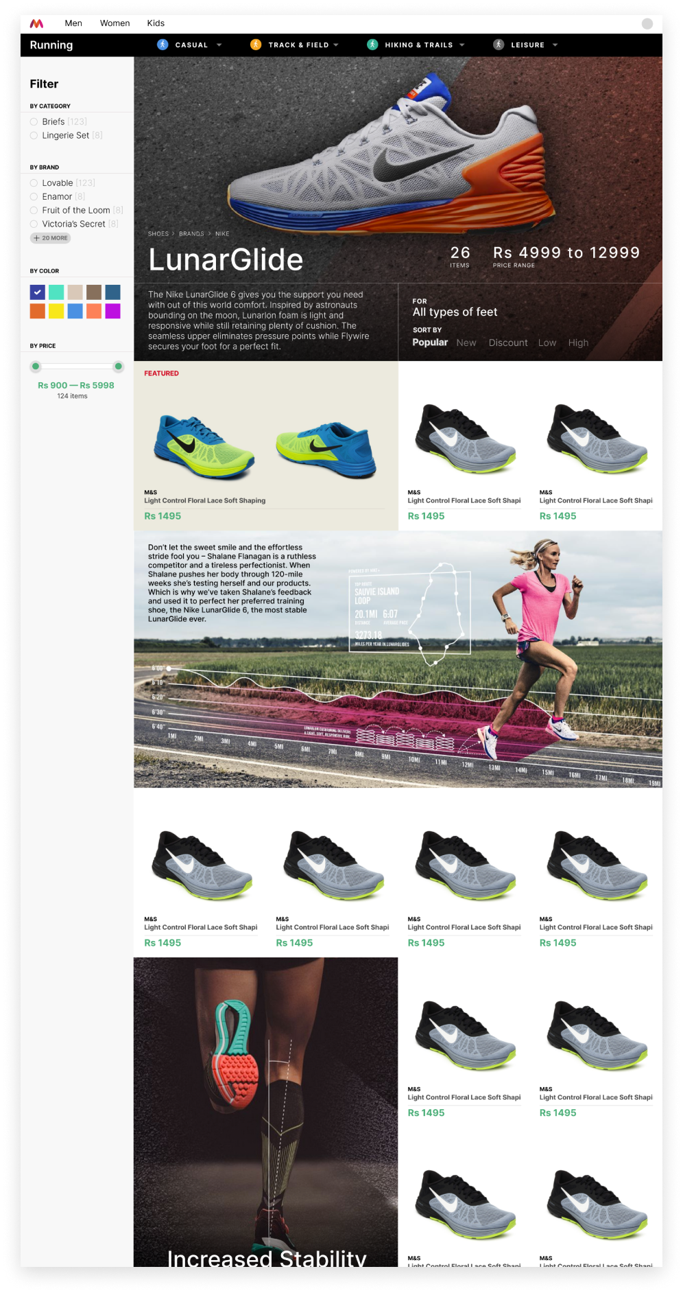
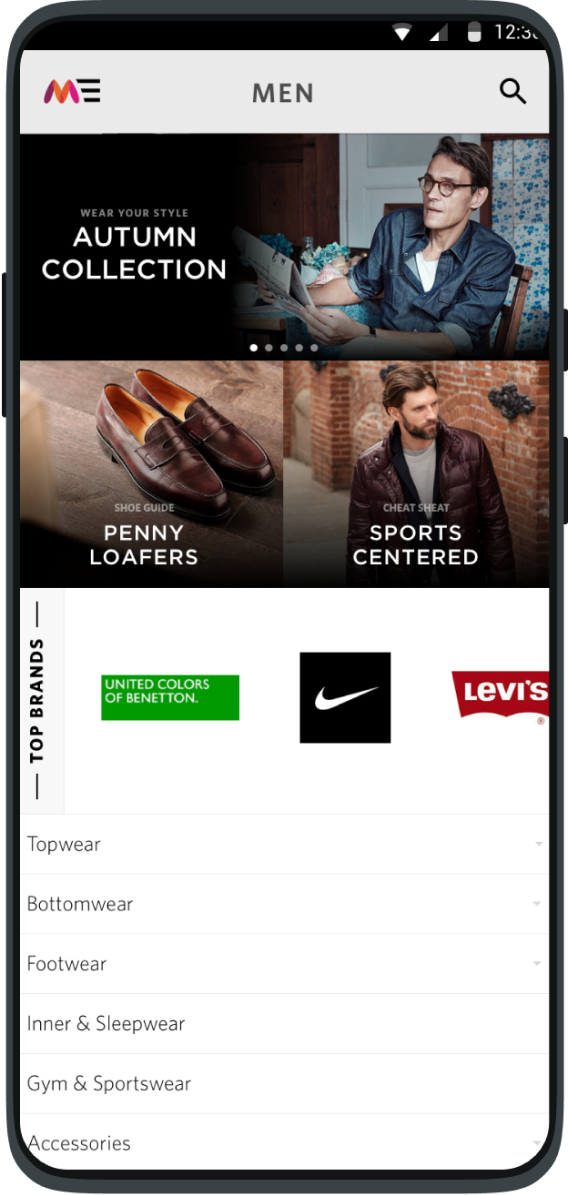
We ensured our designs were fully customisable so as to offer customers of each category a unique and interesting experience. Each part of the design differs to highlight that particular category or subcategory of products delivering customers with the essential information they need for that section. For example, the look and feel of the men’s sports shoe category was distinguishable and distinct from the women’s lingerie section.
However, this didn’t mean the site was a jumble of designs. The website followed a similar style and language throughout, with a unifying visual thread while still allowing the playfulness of each item to come through. The marketing teams could easily update the website while being secure in the knowledge that the beautiful design would adapt to and match their new content.
We created illustrations that enhanced the design direction and helped users find categories and subcategories easily. These acted as navigational aids to explore a variety of product lines.
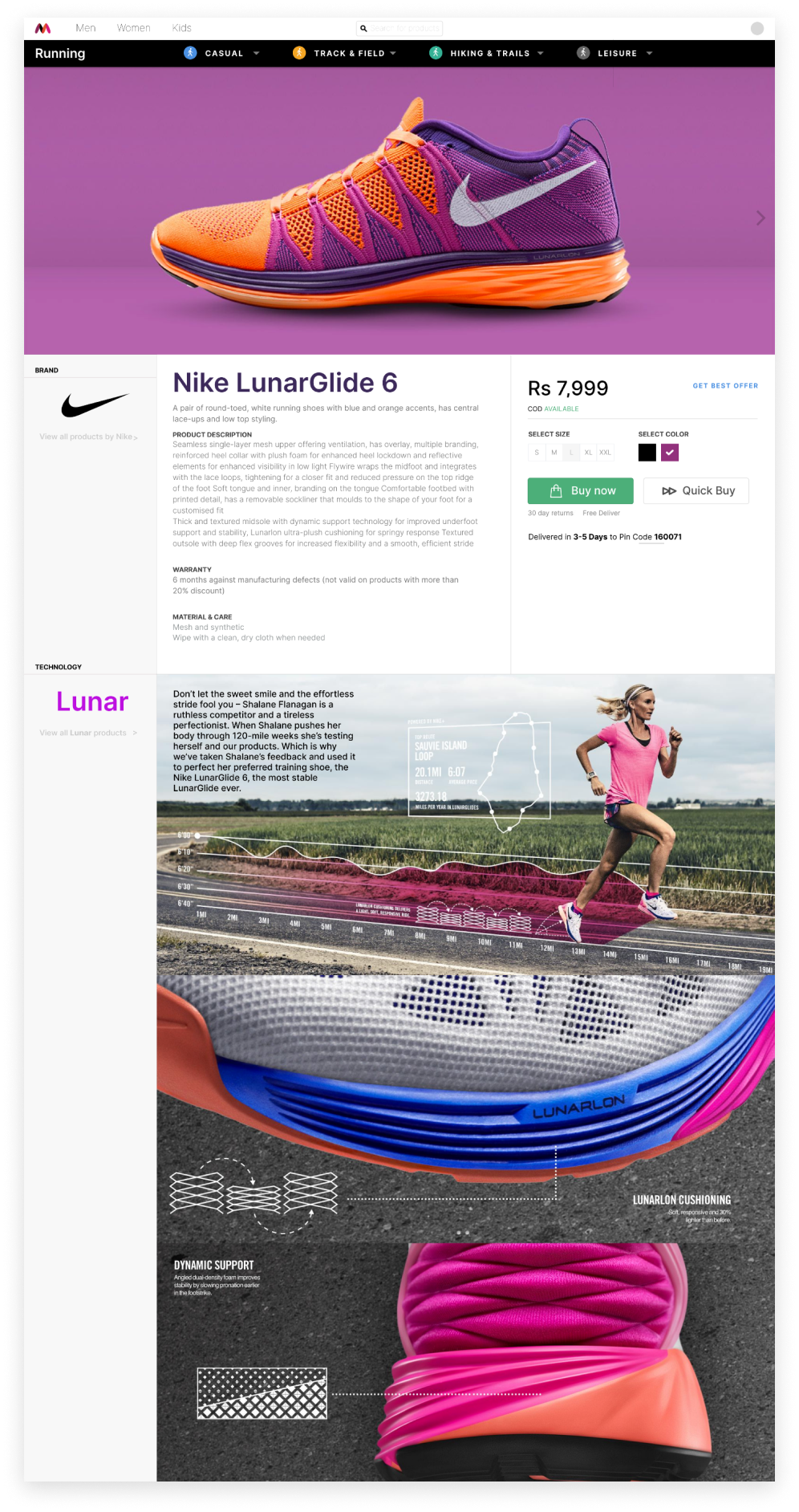
In 2013 consumers were still very cautious about online shopping. Buying expensive fashion products online remained a contentious decision, and we were determined to minimise design barriers that added to the stress of the process. We were careful to make the product details the focus, with beautiful high-resolution photographs and clearly delineated content blocks.
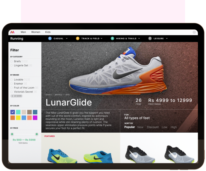
Products were displayed front and centre, while key decision-making points (like price, colour, availability, size and fit) were showcased using strong call-to-actions. Magazine-style insets were included for the high-end products, assuaging customer concerns and answering any FAQs with regard to product features.
We designed it so that in cases where the product details were minimal, the interface still adapted seamlessly by highlighting images and scaling the page to show other product recommendations.
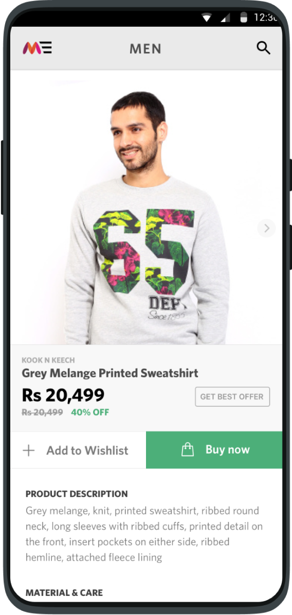
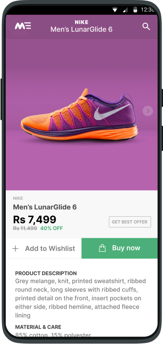
Shoppers visiting Myntra.com from a web browser weren’t ignored, with tailored pages adapting the designs to smaller devices. Navigation to key sub-categories were surfaced, as was the rich content which dominated the desktop storefronts.


The USPs
- Adaptable product pages that adjust as per the amount of content Emphasising the quality of high-end products to help with customer trust
- Cohesive and convenient design that showcases a variety of styles and products
- Emphasising the quality of high-end products to help with customer trust
More Projects


